It’s the first thing visitors see when they come to your site.
If your landing page hero is unclear, uninteresting, or irrelevant, visitors bounce.
In those first few seconds, they asses:
- What you do
- Whether you’re right for them
Here are a few ways you can improve it and keep visitors on your site.
Header
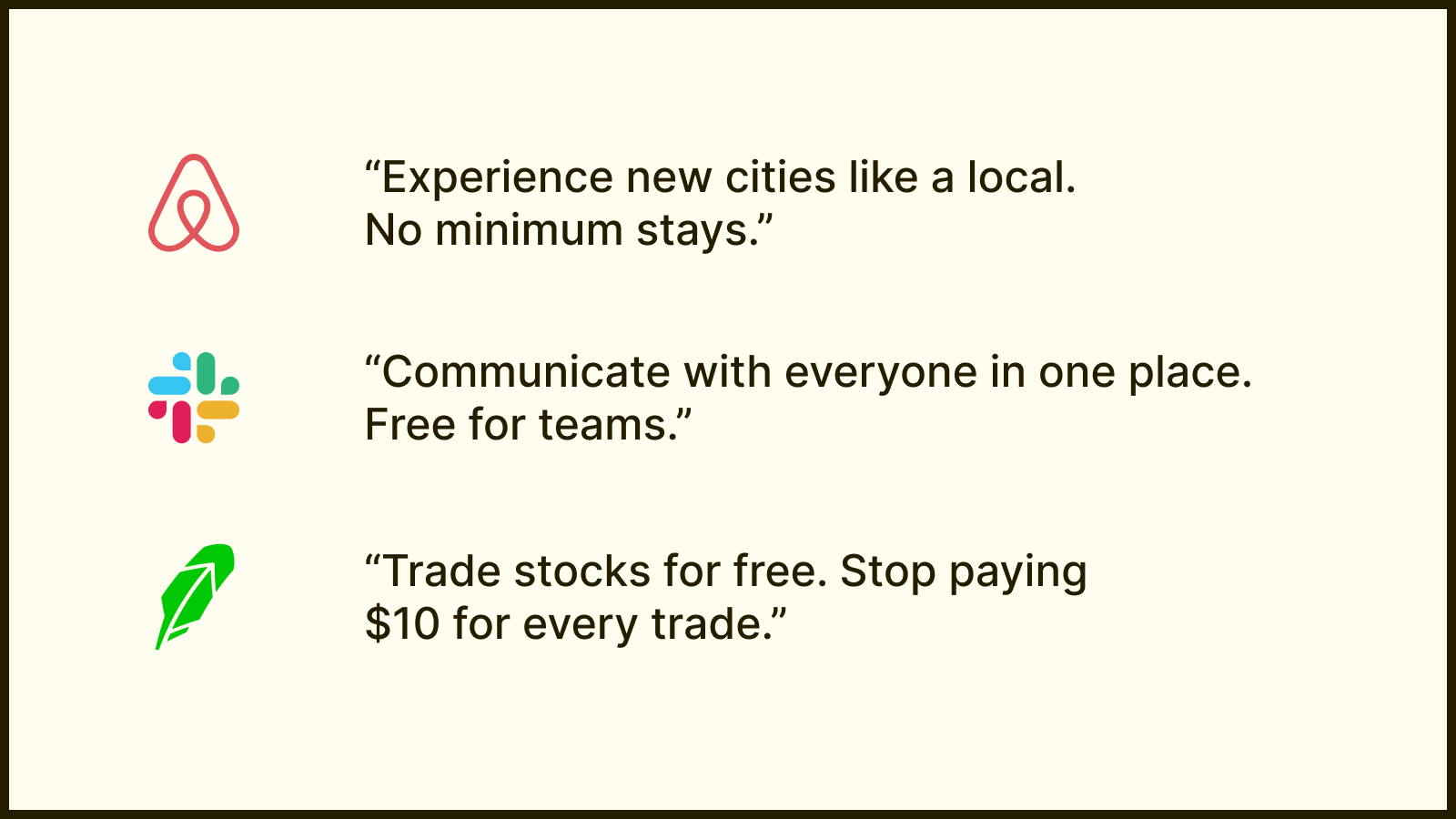
In your header, you need to state the value you provide.
A way to do this is to state how your product solves their problem better than competitors or no solution at all.
Then you add a hook: Something that wows OR something that addresses an objection.

Subheader
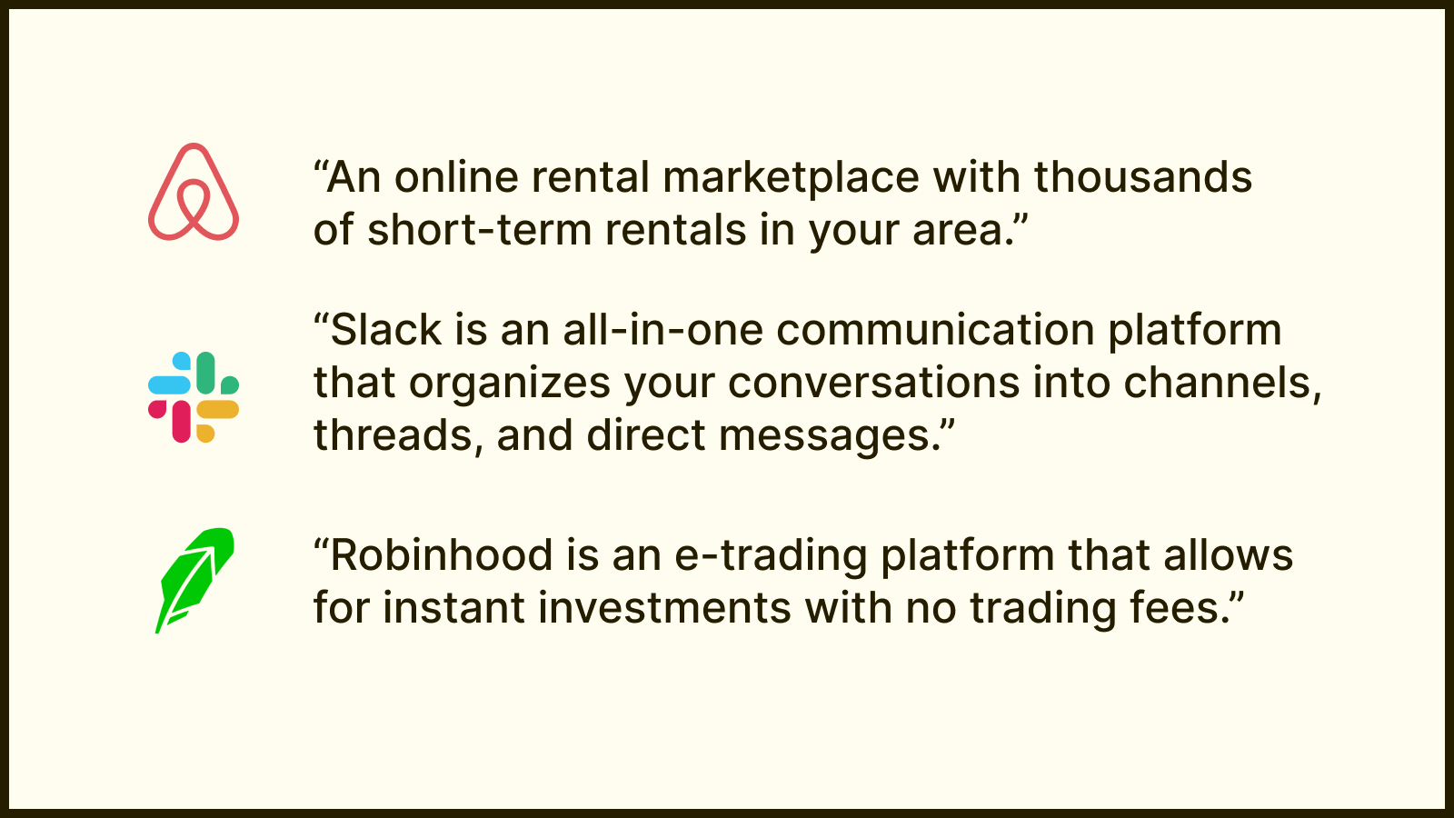
Here, you state what your product does exactly.
Expand on what you wrote in your header —how does it work?
Talk about your top 1-2 features. And keep it brief.

CTA
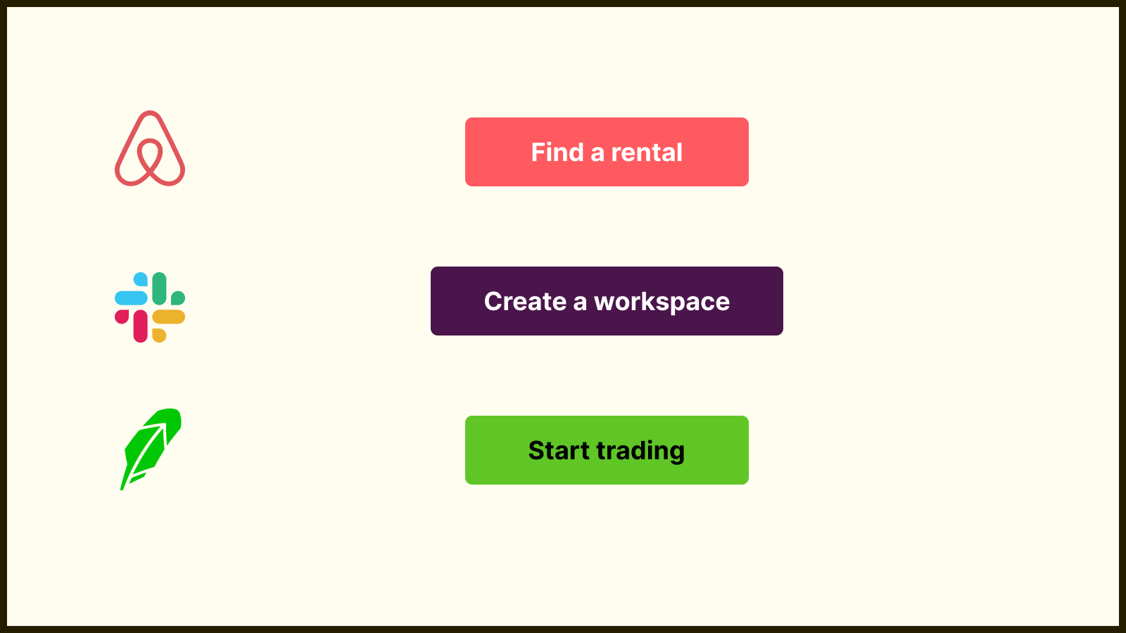
CTAs continue the narrative you’ve laid out in your header & subheader.
Keep it contextual and relevant. (ie. “Get Started” is generic).

Design
A few tips on design:
- Keep it straightforward —People are there for the product not your landing page transitions and animations.
- Show the product in action —Use a GIF or video showing the core use-case of your product.
- Show off that others use it —Adding pictures of people enjoying your product and other social proof doesn’t hurt.
Want more product tips? 👉 The Product Person