1) Be clear, concise, and useful
Duh. This one’s obvious.
People don’t like being forced to read. Identify the most important info and say that.

2) Use consistent wording
Another obvious one —don’t use synonyms.
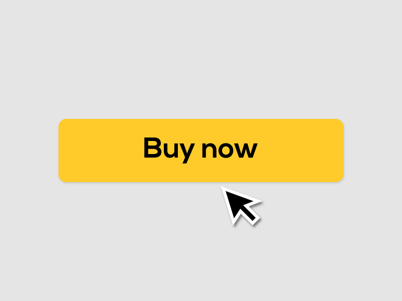
If one button says “Next”, don’t also use “Proceed” or “Continue” for other buttons.
Inconsistency confuses users. They may think “Next” and “Proceed” lead to different results.

3) Create a microcopy framework
To ensure your wording stays consistent, create a doc for you and your team that houses your most common words.
Get everyone singing the same song.

4) Be conversational
Talk like two co-workers over lunch —casual, friendly tone in a professional setting.

5) Use humor and idioms carefully
The tone is casual, but the same jokes can get stale.
Or even worse, no one gets it.

6) Highlight your brand’s character
Even so, make routine tasks memorable by adding a bit of flair.
If your brand is playful, don’t be afraid to add emojis.

7) Be wary of word translations
You wouldn’t want your product to break in other countries, right?
Here’s a good article from Dropbox to help with this.

8) (Almost) always use the active voice
It’s stronger and easier to understand than the passive voice.
Use it when you need to signal who or what caused an action.

9) Use the passive voice (sometimes)
It has its place.
Use it when the action is more important than what caused the action (aka the subject)

10) Provide context
Answer this question for the user: “Why exactly am I here?”
Focus on relevance.

11) Assume your user is smart
Everyone knows what to do when they see a form.
Save your breath.

12) Keep it scannable
Reading is work. Every word takes energy. Users like to save energy by skimming.
Leave out the unimportant. They’ll get the gist.

13) Write short paragraphs and sentences
Keep ‘em short and snappy.
snap snap

14) Don’t overuse contractions
They make text sound informal and easier to read.
Overused, they become distracting and can make text look messy.

15) When to use sentence case
Sentence case is when you only capitalize the first letter of the first word in a phrase.
Use it most of the time —especially for buttons and links.

16) When to use title case
Title case is when you capitalize the first letter of each word, besides small words like conjunctions and prepositions.
Use it for phrases 2-3 words long —6 max.

17) Capitalize proper names & terms
Don’t capitalize unless they’re proper terms, branded terms, or terms for a specific functionality.

18) When to use “Your”
When using “your” the product feels like a personal assistant. It should be used in a social, collaborative setting —like a project management app or a smart device.
Use it for what the product creates for the user.

19) When to use “My”
“My” implies individual control and ownership. It should be used where data is sensitive and a sense of security is needed —like a tax return site.
Use it for what the user creates in the product.

20) Keep ‘em calm
Point out concerning actions before your user has time to question your motives.

21) Refer to the user
Use you and your to address the user directly.
However, using a personal pronoun isn’t necessary in cases where you’re not distinguishing items that belong to the user from items that belong to others.

22) Identify interactive elements
Use action verbs.
People should be able to tell at a glance what an element does.

23) Start with verbs
It’s more direct and hooks the user’s attention.

24) Prompt action
Remember this: Information → Action

25) Motivate action
Sometimes, people need a little nudge.
Give them training wheels that will subconsciously disappear over time.

26) Set expectations
Show users what they should expect.

27) Instruct action
Inform users how to perform an action.

28) Show progress during actions
Reassure the user that what they want is on the way.

29) Give feedback after actions
Reassure the user that what they want has been completed.

30) Use constructive feedback model
Empower the user.
If they can have new abilities, emphasize it. → “Yes, and…”
If they can’t do something, tell them why and how they can fix it. → “No, because…”

31) Avoid destructive feedback
It’s unhelpful and depressing.

32) Create positive moments
People will remember how you made them feel.
Bring delight.

33) Pair visuals with words
The right visuals paired with the right words emphasize the message.

34) Be consistent with imagery
Similar to consistency with words —inconsistency of visuals can confuses users.
Unless you plan to shift the visuals entirely to pair with a shift in the messaging.

35) Use familiar words and phrases
In general, avoid acronyms and technical sayings that people might not understand.
Use what you know about your audience to determine what’s appropriate.

36) Spell out numbers up to nine
In body copy, spell out numbers up to nine.
Use numerals after 10.

37) Reassure users with social proof
Show the user that they’re making the right choice in using your product.

38) Pick the right moments
Show only what’s necessary —when it’s necessary.

39) Test and improve
Experiment and see how people respond. Iterate, test, and improve what needs work.
Contextualized wording is better than generic wording.

40) Think: “How can I improve your life?”
No one cares about what you can do. They only care about what you can do for them.

Whew.
I know, it’s pretty long. But I hope it’s helpful for you and your team.
You can find more content like this in my newsletter.
I’d also appreciate if you could show love to my twitter thread about it. If you can’t, no worries :)